Choosing the right color scheme is essential for a kitchen makeover. The colors you select will not only influence the overall look of your kitchen but also the mood and functionality of the space. Colors can make a kitchen feel larger, cozier, or more modern, depending on the combination. A well-thought-out color palette can highlight key design elements, improve the atmosphere, and even increase the appeal of your home.
Whether you’re looking to create a bright and airy environment or a sleek and modern vibe, selecting the right kitchen colors can transform the heart of your home.
In this guide, we will explore some of the best kitchen color schemes that will help you achieve a stunning makeover.
Why Choosing the Right Kitchen Color Scheme Matters
Selecting the right kitchen color scheme is crucial for both the visual and functional aspects of the space. The colors you choose will directly affect the mood, atmosphere, and perception of your kitchen, making it an important decision in any remodeling project. Not only do colors create an immediate impression, but they can also influence how comfortable and inviting your kitchen feels.
Emotional and Visual Impact
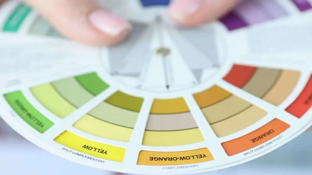
Colors have a profound effect on how a kitchen is perceived. For example, light shades like white and soft pastels can make a kitchen feel more spacious and open, which is particularly useful in smaller spaces. On the other hand, darker tones, such as deep blues or blacks, can add a sense of sophistication and coziness to larger kitchens. These colors can also be used to create contrast and focal points, enhancing the overall design.
Colors also affect emotions. Warm hues like yellows and reds can create a welcoming, energetic vibe, making the kitchen a more social and lively environment. Cooler tones, like blues and greens, tend to evoke a calming and serene atmosphere, perfect for those who prefer a tranquil cooking space.
Practical Considerations
Beyond aesthetics, practicality matters when choosing a kitchen color scheme. Colors can be used to solve specific design challenges. For instance, if your kitchen lacks natural light, lighter colors can brighten the space, making it feel more open and inviting. Alternatively, if you have a large kitchen and want to make it feel more intimate, darker shades can bring the room together, creating a cozier atmosphere.
Another practical factor is maintenance. Lighter shades may show dirt or stains more easily, so high-traffic kitchens might benefit from darker, more forgiving tones. This balance between visual appeal and practicality is why choosing the right color scheme is such a vital part of any kitchen design.
1. Classic White: Timeless Elegance
White remains one of the most popular and enduring choices for kitchen color schemes. Its versatility allows it to suit a wide range of design styles, from modern to traditional, while its clean and bright appearance brings a sense of freshness to the space. A white kitchen can also act as a blank canvas, providing the perfect backdrop for introducing textures and accents that add depth and character.
The Beauty of an All-White Kitchen
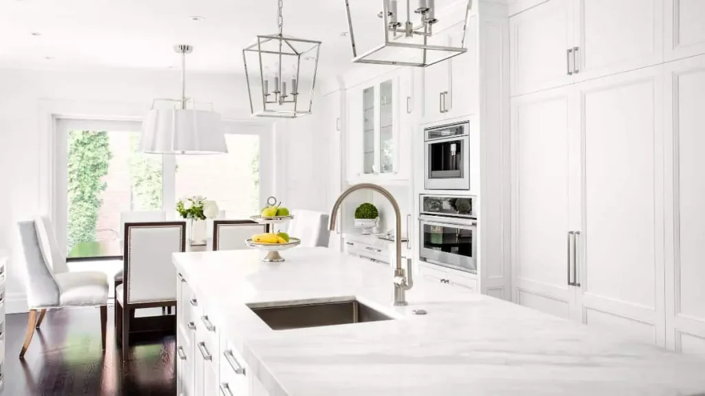
An all-white kitchen is often admired for its simplicity and brightness. White surfaces naturally reflect light, which makes the space feel larger and more open. This can be especially beneficial for smaller kitchens or those with limited natural light. White creates an effortless sense of cleanliness, which is why it is frequently chosen by homeowners aiming for a minimalist or contemporary look.
However, while the purity of an all-white kitchen is appealing, it can sometimes feel too sterile if not balanced with other elements. Adding natural textures, such as wood countertops or exposed brick, can help soften the look. Similarly, incorporating matte or glossy finishes on cabinets can introduce subtle variation and prevent the space from feeling too stark.
White with Accents
For those who want the brightness of a white kitchen but prefer a more dynamic design, pairing white with accents is an ideal solution. Accent colors can be introduced through elements like backsplashes, countertops, or even light fixtures. For example, a white kitchen with bold-colored accessories, such as blue bar stools or a vibrant tile backsplash, can create a lively and personalized atmosphere.
Metallic finishes, like brass or stainless steel, are also effective in enhancing a white kitchen. Adding brass hardware or lighting fixtures can bring warmth to the space, while stainless steel appliances offer a sleek and modern contrast. This approach allows you to maintain the elegance of white while injecting some individuality and style into the design.
2. Bold and Dramatic: Black and Dark Tones
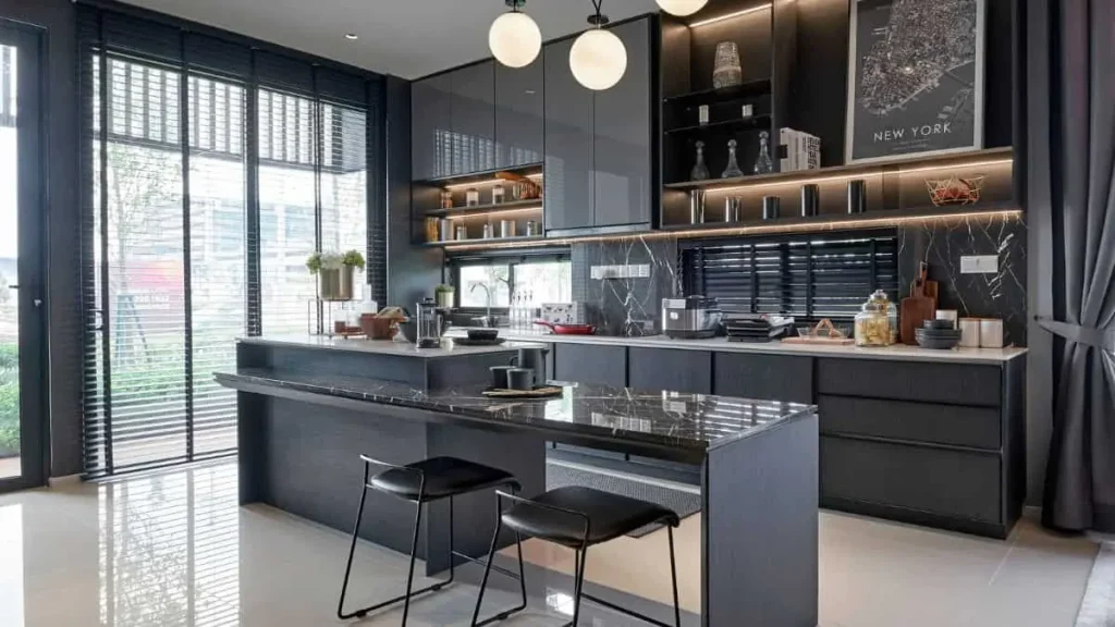
For those looking to create a kitchen with depth and impact, black and dark tones are a bold choice. These colors exude sophistication and can transform a kitchen into a statement space. While darker hues are often associated with modern design, they can work well in a variety of styles, from industrial to rustic. When used correctly, dark tones can give the kitchen a dramatic edge while maintaining a refined, polished look.
Going Bold with Black
Black kitchens have become increasingly popular in recent years, offering a sleek and luxurious feel. Black cabinets, countertops, or walls can create a strong visual contrast, especially when paired with lighter elements. The result is a modern, high-end aesthetic that feels both sophisticated and cutting-edge.
However, using black requires careful consideration of the overall space. In smaller kitchens, an all-black scheme can make the room feel confined. To avoid this, it’s often best to balance black with lighter colors on the walls, ceiling, or flooring. Adding reflective surfaces like a glossy backsplash or stainless steel appliances can also help keep the space from feeling too dark.
Pairing black with metallic finishes is another way to elevate its dramatic effect. Brass or gold accents, for example, can add warmth and richness to a black kitchen, while silver or chrome finishes lend a sleek, industrial vibe. This contrast between matte black and shiny metallics creates a balanced, visually appealing kitchen.
Deep Blues and Greens
In addition to black, dark tones like navy and forest green are gaining popularity in kitchen design. These rich hues offer a unique alternative to more traditional color schemes, providing a sense of depth without being overpowering. Navy blue, for instance, is both bold and versatile, lending itself well to a range of design styles. It can be paired with white countertops or light wood cabinetry to create a balanced, sophisticated look.
Forest green, on the other hand, brings a natural, earthy feel to the kitchen. It works particularly well in spaces where you want to create a cozy, grounded atmosphere. When combined with materials like marble or light wood, deep green tones can soften the overall look while maintaining a dramatic presence. These colors, like black, require a thoughtful approach to ensure they enhance the space without overwhelming it. Proper lighting, lighter accents, and a mix of textures can make these bold tones work beautifully in any kitchen.
3. Warm and Welcoming: Earth Tones and Neutrals
Earth tones and neutral colors create a warm, inviting atmosphere in the kitchen, making them ideal choices for homeowners seeking a cozy, comforting space. These hues, which include shades of beige, brown, taupe, and soft grays, evoke a sense of calm and connection to nature. They provide a subtle backdrop that complements various design styles, from farmhouse to modern rustic.
The Allure of Earth Tones
Earth tones are renowned for their ability to create a grounding effect. These colors mimic the natural environment, providing a serene ambiance that encourages relaxation and social interaction. Incorporating earth tones into your kitchen can be achieved through cabinetry, countertops, and wall colors, creating a cohesive look that feels both timeless and contemporary.
Using earthy shades can also enhance the textures in your kitchen design. For instance, pairing warm browns with natural wood finishes or stone surfaces can highlight the beauty of these materials, resulting in a harmonious aesthetic. The combination of these elements fosters an inviting space, perfect for gatherings or family meals.
Neutrals for Versatility
Neutral colors are incredibly versatile and work well in various kitchen designs. Soft whites, grays, and beiges can create an open, airy feel, especially in smaller kitchens. These colors can also serve as a blank canvas, allowing for easy updates with seasonal decor or accent pieces. By incorporating pops of color through accessories, such as dishware or kitchen textiles, homeowners can keep the space fresh and engaging.
Moreover, neutral tones provide a timeless appeal, ensuring your kitchen remains stylish for years to come. The use of varying shades of neutrals can add depth and interest to the design. For example, combining a light beige with deeper taupe can create a layered look that avoids monotony while maintaining a soft, cohesive appearance.
Creating Warmth with Accents
To enhance the warmth of earth tones and neutrals, consider adding textured accents, such as woven baskets, wooden cutting boards, or ceramic dishes. These elements can introduce tactile variety and make the space feel more lived-in and inviting. Additionally, incorporating plants or greenery into the kitchen design can bring a breath of fresh air, softening the overall look while adding a pop of color and life.
Ultimately, earth tones and neutrals offer a beautiful foundation for any kitchen makeover. Their warm and welcoming nature makes them perfect for creating a space where family and friends can gather and enjoy each other’s company.
4. Bright and Playful: Pops of Color
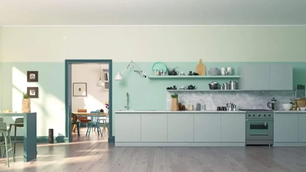
Incorporating pops of color into a kitchen design can infuse the space with energy and personality. These vibrant hues serve as accents that can brighten the overall aesthetic and create a lively atmosphere. Whether through appliances, accessories, or statement walls, the strategic use of color can transform a kitchen from ordinary to extraordinary.
The Joy of Colorful Accents
Adding colorful accents allows homeowners to express their unique style without overwhelming the space. For instance, bright bar stools, vibrant dishware, or bold artwork can serve as focal points that draw the eye and spark conversation. This approach enables you to incorporate trendy colors that can easily be changed over time, keeping the kitchen feeling fresh and updated.
Using pops of color in smaller elements also allows for creativity and experimentation. A playful backsplash with cheerful tiles can serve as a stunning visual anchor, while colorful rugs or curtains can add warmth and charm. These elements work together to create a cohesive look that feels both inviting and dynamic.
Choosing the Right Color Combinations
When selecting pops of color, it’s important to consider the existing color palette of your kitchen. Bright colors can be paired effectively with neutral tones to create a balanced look. For example, a predominantly white kitchen can be enlivened with sunny yellow chairs or a striking turquoise countertop. This contrast not only adds visual interest but also highlights the vibrant hues in a more subtle, harmonious way.
It’s also beneficial to think about the emotions associated with different colors. Warm colors like red and orange can evoke feelings of excitement and warmth, making them suitable for a bustling family kitchen. In contrast, cooler colors like teal or mint green can create a calming effect, ideal for a serene cooking environment. By carefully choosing color combinations that resonate with your personal style and the intended atmosphere of the kitchen, you can create a space that is both functional and enjoyable.
Seasonal and Trendy Updates
Incorporating pops of color allows for easy updates as trends change or seasons shift. Simple swaps, such as changing out dish towels, adding new artwork, or incorporating seasonal decor, can significantly refresh the space. This flexibility enables you to stay in tune with current design trends without committing to permanent color choices.
Ultimately, using pops of color in the kitchen invites creativity and joy into the heart of the home. By thoughtfully incorporating vibrant hues, you can craft a playful and inviting atmosphere that reflects your personality and enhances your cooking experience.
5. Soft and Serene: Pastels and Light Shades
Pastels and light shades offer a refreshing and tranquil atmosphere in kitchen design, making them an excellent choice for those seeking a serene space. These gentle hues create an inviting ambiance that promotes relaxation and enjoyment, perfect for culinary adventures and family gatherings.
The Charm of Pastel Colors
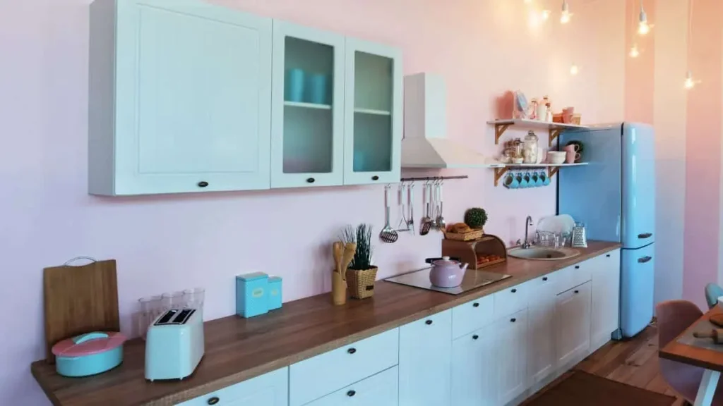
Pastel colors, such as soft pinks, baby blues, mint greens, and lavender, bring a whimsical and cheerful quality to the kitchen. They evoke a sense of nostalgia while remaining modern and stylish. Incorporating these shades can make a kitchen feel more airy and spacious, as they reflect light and create a sense of openness.
Using pastel colors can also provide a subtle backdrop that allows other design elements, such as cabinetry or decor, to stand out. For instance, soft blue cabinetry can pair beautifully with white countertops, creating a harmonious look that feels both fresh and inviting. This color choice lends itself well to various styles, from coastal to vintage-inspired designs, making pastels highly versatile.
Light Shades for a Bright Kitchen
Light shades, including soft whites, creams, and light grays, can enhance the feeling of brightness in a kitchen. These hues create an illusion of space, making even smaller kitchens appear larger and more open. Light shades provide an excellent canvas for introducing texture and layering elements, such as wood or stone, which can add depth to the design.
Additionally, light shades work seamlessly with a range of accent colors, allowing homeowners to personalize their kitchen without overwhelming the space. By adding touches of vibrant accessories or colorful dishware, a predominantly light kitchen can maintain a fresh and lively atmosphere while still feeling serene.
Creating a Harmonious Space with Pastels and Light Shades
To maximize the calming effect of pastels and light shades, it’s essential to balance these colors with thoughtful design choices. Incorporating natural elements, such as wood or greenery, can help ground the space and create a warm, inviting environment. This combination enhances the overall aesthetic and contributes to a feeling of tranquility.
Incorporating pastels and light shades into your kitchen design creates a soft, serene environment that promotes relaxation and connection. By carefully considering how these colors interact with other elements, you can craft a kitchen that is both visually appealing and functional. This design approach not only reflects personal style but also fosters a welcoming atmosphere where family and friends can gather and create lasting memories.
Read Also: Top 10 Kitchen Lighting Options
Trending Kitchen Color Schemes for 2025
As we look toward 2025, kitchen color trends are shifting to reflect a desire for warmth, sustainability, and individuality. Homeowners increasingly seek color schemes that not only enhance their kitchen’s aesthetic but also create a welcoming environment that resonates with their lifestyle.
Nature-Inspired Palettes
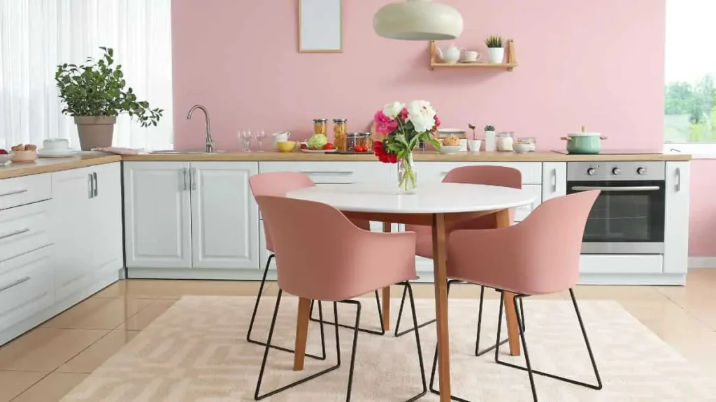
One of the most significant trends for 2025 is the embrace of nature-inspired palettes. Shades derived from the natural world, such as earthy greens, deep browns, and sky blues, are becoming popular choices. These colors create a calming atmosphere and foster a connection to the outdoors, which many homeowners desire in their living spaces. Incorporating these hues can transform a kitchen into a tranquil retreat where one can unwind while cooking or entertaining.
The use of natural tones can also be complemented by organic materials, such as wood, stone, and natural fibers. For example, pairing an earthy green with rich wooden cabinetry can create a harmonious and inviting space that feels grounded and authentic. This trend reflects a growing awareness of sustainability, as many people seek to incorporate eco-friendly design elements into their homes.
Monochromatic Looks with Bold Accents
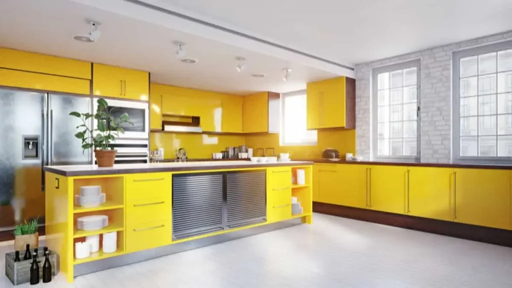
Another emerging trend is the use of monochromatic color schemes, combined with bold accent colors. This design approach allows for a sophisticated and cohesive look while incorporating pops of color to create visual interest. For instance, a kitchen painted in varying shades of gray can be energized with bright yellow appliances or accessories, adding personality without overwhelming the space.
This trend emphasizes the importance of balance. Homeowners can choose a primary color that reflects their style and then introduce contrasting accents to create focal points throughout the kitchen. This technique allows for a personalized touch, as each homeowner can curate their space to reflect their unique taste while maintaining a streamlined aesthetic.
Emphasis on Dark and Rich Tones
As we move into 2025, dark and rich tones are also gaining popularity. Deep navy blues, charcoal grays, and forest greens create a dramatic and sophisticated environment, making kitchens feel luxurious and intimate. These colors can serve as an excellent backdrop for lighter elements, such as countertops and fixtures, enhancing the overall design without making the space feel cramped.
To successfully incorporate darker hues, it is essential to consider lighting and layout. Well-placed lighting can help brighten these spaces and highlight key design features, ensuring the kitchen remains functional and inviting. Additionally, combining dark tones with metallic accents, such as brass or gold, can elevate the design, adding an element of glamour.
Personalized Color Combinations
Ultimately, the trend for 2025 is about personalization. Homeowners are encouraged to experiment with color combinations that resonate with their unique style and preferences. Whether it’s a bold kitchen filled with vibrant hues or a serene space adorned with soft pastels, the focus is on creating a kitchen that feels authentic and welcoming.
This trend emphasizes that the kitchen is not just a functional space but also a reflection of individual tastes and lifestyles. By exploring various color schemes and design elements, homeowners can craft a kitchen that serves as the heart of their home, fostering connections and memories for years to come.
How to Choose the Perfect Color Scheme for Your Kitchen
Selecting the right color scheme for your kitchen is a crucial decision that can significantly influence the overall ambiance and functionality of the space. A thoughtful approach to color can enhance the aesthetics, promote comfort, and create an inviting environment for family and guests alike.
Assessing Your Space
The first step in choosing the perfect color scheme involves a thorough assessment of your kitchen space. Consider the size of the kitchen, the amount of natural light it receives, and the existing architectural features. For instance, smaller kitchens may benefit from lighter colors that create an illusion of spaciousness, while larger areas can accommodate darker, richer tones without feeling closed in.
Additionally, take note of how light interacts with the space throughout the day. A well-lit kitchen may allow for bolder colors, while a space with limited natural light might be better suited to softer shades that reflect light and create warmth.
Defining Your Style and Preferences
Next, it’s essential to define your personal style and preferences. Consider what atmosphere you want to cultivate in your kitchen. Do you prefer a modern, sleek look, or do you lean toward a cozy, rustic feel? Your choice of color should align with your overall home decor and reflect your personality.
For example, if you enjoy a more traditional look, soft creams and muted greens may be ideal. Conversely, if you are drawn to contemporary aesthetics, bold colors or monochromatic schemes might be more appropriate. Gather inspiration from various sources, such as design magazines, online platforms, and even nature, to identify colors that resonate with you.
Considering Functionality
Functionality is another critical factor when selecting a color scheme. The kitchen is often a high-traffic area, so choosing durable and easy-to-maintain colors can be beneficial. Light colors can show stains more readily, while darker shades may hide wear and tear better. Additionally, consider how the chosen colors will work with your appliances, cabinetry, and countertops.
Moreover, think about how color can affect mood and behavior in the kitchen. Warm colors, like yellows and reds, can stimulate appetite and conversation, making them suitable for family gatherings. In contrast, cool colors, such as blues and greens, can create a calm and serene environment, ideal for a relaxing cooking experience.
Testing Your Choices
Before finalizing your color scheme, it is wise to test your choices in the actual space. Purchase sample paint pots and apply patches to the walls to observe how the colors look at different times of the day and under various lighting conditions. This process allows you to see how the colors interact with your kitchen elements and ensures you are satisfied with the overall effect.
Additionally, consider creating a mood board that includes your selected colors, along with samples of materials and textures you plan to use. This visual representation can help you visualize the final look and ensure all elements harmonize well together.
Conclusion
Choosing the right color scheme for your kitchen is a pivotal aspect of home design that can profoundly influence both aesthetics and functionality. By carefully considering factors such as space assessment, personal style, and practical needs, you can create a kitchen environment that is not only visually appealing but also welcoming and conducive to culinary creativity.
From timeless whites to bold dark tones, warm earth shades to playful pops of color, the options for your kitchen color scheme are vast and varied. Emerging trends for 2025 emphasize nature-inspired palettes, monochromatic looks with bold accents, and the use of rich, dark tones, reflecting a desire for personalization and warmth in our living spaces.
As you embark on this exciting journey, remember that the kitchen serves as the heart of the home—a place for gathering, creating, and enjoying meals together. By selecting colors that resonate with your personality and lifestyle, you can transform your kitchen into a beautiful and functional space that enhances everyday experiences and fosters lasting memories. With thoughtful planning and a clear vision, your kitchen makeover can be a true reflection of you, making it a delightful hub for family and friends alike.
FAQs
How do I choose the right color scheme for a small kitchen?
For small kitchens, lighter colors can make the space feel larger and more open. Consider using whites, pastels, or soft neutrals to create a sense of space.
What are the best color schemes for a modern kitchen?
Modern kitchens often feature sleek, minimalist designs. Popular color schemes include monochromatic palettes, high-contrast combinations like black and white, and cool tones like gray and navy.
Can I use dark colors in a small kitchen?
Yes, you can use dark colors in a small kitchen, but it’s essential to balance them with lighter elements. Dark cabinets paired with light countertops and backsplashes can create a dramatic yet balanced look.
How often should I update my kitchen color scheme?
There’s no set rule for updating your kitchen color scheme. However, if your kitchen feels outdated or you’re craving a change, it might be time for a refresh. Trends evolve, and personal tastes change, so update as often as you see fit.
Are there any color schemes to avoid?
While there are no strict rules, it’s best to avoid overly trendy colors that might quickly go out of style. Also, be cautious with very dark or very bright colors in small kitchens, as they can make the space feel cramped or overwhelming.


